This tutorial details how I went about drawing the second panel on Page 1 of Hurt! You can have a look at the script and thumbnail page by clicking on their respective links, and the finished pencil art will be up soon.
Preparation:
You will need the following tools:
- Paper. If you're drawing for a comic book, just draw directly on your layout page.
- Pencils. You want a pencil with a hard lead like a 4H. Firstly because it's lighter and secondly because harder leads stay sharper for longer and sharpness is essential. I use a good old-fashioned wood-bound pencil that I sharpen with a blade, but you can use a mechanical pencil if you prefer.
- A ruler. Preferably a really long one. Your vanishing points can be quite far off your page sometimes so you need a straight-edge that will reach that far.
- A set square. This makes it pretty easy to get your right angles accurate. Also very useful for doing a quick series of parallel lines.
- A french curve and an ellipse template or two. Like a straight-edge but for curved lines. When doing curves and ellipses without these they'll look sketchy. These tools help keep your curved lines nice and crisp.
- Patience. It takes a lot of time to do an accurate, elaborate perspective drawing, and it can be a little repetitive too, especially when you're drawing a massive cityscape or even just a single building with a lot of architectural detail. It's worth the effort when you're done though!

Above is a simple map layout. The graph paper makes it pretty easy to quickly map out a scene in your mind and decide on the position of things. It also greatly simplifies the geometric considerations and eliminates the need to measure everything, though a ruler is still useful for keeping your lines neat. You can also use the squares as a rough guide of scale.
You'll also want a rough sketch of how you envision the scene looking. this is for your reference only so it can be as neat or as rough as you like. The important part is that it gives you enough information to accurately create your scene when you get down to the final crunch. This is a quick throw together of the scene described in the script for the second panel on Page 1.

Panel 2. Much closer in now, focusing on the exterior of a mansion. There's a party going on in the garden. Tables decked with food surround a bunch of mingling well dressed guests. A good time is being had by all.The script calls for a party outside of a mansion. As an artist we'll need to put a little thought into what this mansion would look like. We know that it's set in Cape Town from the description of the first panel but the rest is up to us. I decided I wanted to go for a classic looking mansion rather than something modern and even though I haven't spent a lot of time in and around Cape Town I know that the city is famous for it's Cape-Dutch architecture. I do a little research to fill in the holes in my existing knowledge and find that a few hallmarks of the Cape-Dutch style are the H-shape of the building, the ornate gables and the french windows. Research is always a good idea when tackling this sort of project and can help you to add a lot of authenticity to your drawings. Now we start with the technical stuff!
Step 1: Establish your eye-line and main vanishing point.
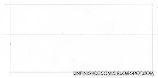 The outer box here is the outline of our comic book frame. We can consider the frame to be a snap shot of what we are looking at. Imagine for a moment that you have an infinitely long piece of string that extends from the dead centre of your camera's lens all the way to a really distant focus point with no slack in the line. In the photograph that infinitely long string would appear as a simple dot and any lines running parallel to that string will all seem to be pointing towards it. This is our vanishing point. Not every line in our image will point towards it. Only the lines that are parallel to our imaginary string. If we turn that stretch that string out so that it becomes a horizontal sheet instead we will have a line across our photograph that divides it into 2 equal halves. This is our eye-line. Any object below it will be seen from above, and any object above it will be seen from below. People often refer to the eye-line as the horizon, but they are not necessarily the same thing. The horizon and eye-line will only be the same if the viewer is looking directly out towards the horizon, (so that the imaginary string in our example is perfectly parallel to the ground.) With a high shot looking down, the horizon is above the eye-line, and with a low shot looking up the horizon is below the eye-line. I've decided that I want the view point to be straight out towards the horizon so I've put my eye-line exactly in the centre and marked the centre of that as my vanishing point.
Step 2: Block in your main object.
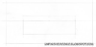 I decided in my planning stage that I wanted to see the mansion from a high vantage point, to establish the setting rather than focus on the party guests, taking into account the events i know are coming up in panel 3 from the script. Referring to my plan sketch I figure that the lower edge of the roof should coincide with my eye-line so I draw in a block with roughly 3 quarters below the eye-line and a quarter above it.
Step 3: Give your object some depth
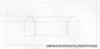
I've now drawn in the basic shape of the gables of the 2 wings and decided how wide I would like them to be. I extend some guide lines from each of the corners back to the vanishing point, and use these as a reference to draw in the main body of the house. It's already starting to look like a 3D object now, though it's still very rudimentary and unembellished.
Step 4: Build up the shape.
 Now I've added in the position of the central foyer which extends forward from the main body of the building. I've added in chimneys and I've started laying out perspective guides for some of the foreground details. I've also added in a guideline for the perimeter wall of the grounds. I didn't calculate the position of that with perspective but did it by eye as it is a fairly arbitrary background object and the effort would not have been justified. I put it in a position that looked to be about one storey high, a fair distance from the main building.
Step 5: Add in details
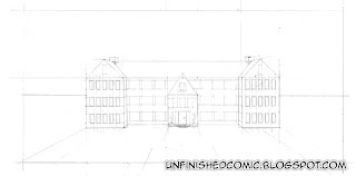
I've marked out the position of the windows. I know how many windows I want and their rough position from the plan sketch that I did before I started. Now it's just a matter of pain-stakingly measuring them out and drawing them in. For the windows on the side walls I have estimated approximate positions and diminished the width of the more distant ones by eye.
Step 6: Foreground Details
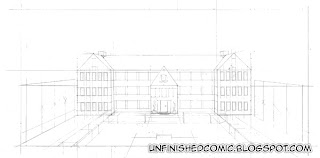 With the main body of the house sorted out I turn my attention to the foreground. Draw in the pool and the tables and mark the position of the trees. As the trees get further and further away the gap between them appears to get narrower as a result of perspective and foreshortening. There are accurate geometrical methods for working out the diminishing gap but that sort of mathematical perspective is a complicated affair. If anyone is interested I will do a proper tutorial on it down the line, but in the mean time I've cheaped out and used a short cut that gives good results in a fraction of the time. I used 5 trees on each side and marked out the height of the first tree and projected perspective lines back to the vanishing point. I then marked out the height of the last tree forming a quad. I then drew diagonal lines from the opposing corners to mark out the perspective centre, the position of the third tree. I then repeated that process to find the positions of the second and fourth trees.
Step 7: Finish it up
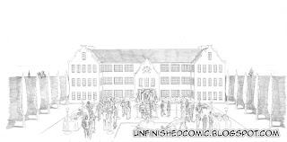
Now we've come to the end of a very long road, and start on another one. I used a darker pencil for the above steps so that the scanner would actually pick up the pencil, if you've been using a hard pencil like a 4H and don't press too hard then you should have fairly feint guide lines on your page. If they're kinda dark then simply take your eraser and lighten them to a point that you can still see them but they're not too pronounced. You don't want to see any of those lines in your final drawing. The first thing I did in the clean pencil art was to draw in all the people and objects in the foreground and then slowly worked towards the background, adding details as I went.
I am almost done with the rest of this page's pencil artwork and I will post it soon. In the mean time, if you'd like a taste of what's coming have a look at this example of pencil comic book art, and the inked version and final coloured piece.


