Sunday, March 29, 2009

Photoshop Tutorial: Colorizing Graphite Drawings

This is a technique for colorizing a graphite drawing or sketch to make it look like it was drawn in colored pencil. I use Photoshop, so that's how the tutorial is presented, but it should be possible to modify this technique and use it in GIMP.


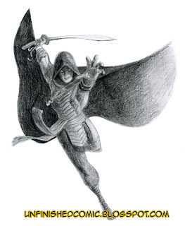
The techniques used here work best on a detailed pencil drawing with a lot of tonal variation. It's designed to keep the texture of the original pencil strokes in tact while creating an explosion of colour to add interest to the piece. By that I mean, if it starts rough and grainy, it'll end up rough and grainy, and if it starts finely textured your end result will be too, so make sure that you get your original drawing to the state you want it at before you scan and start. The image above is a drawing I did a few years ago. It's fairly detailed, with a strong grainy paper texture.
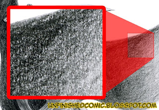


As you can see in the picture above, shading with graphite generally relies upon the interaction of the black graphite dust and the white paper beneath it to give the impression of shades of grey, and for this reason you'll probaby get disappointing results if you simply used the "Hue/Saturation" modifier. Your colors would appear very dull and quite dark, because it's still a lot of black dust on a white backround with only a slight bit of grey to actually add colour to. Thus the first thing we need to do is to turn the blacks and white into shades of grey.
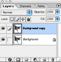

Start by duplicating your background layer. There are several ways to do this and I assume you already have a personal favourite, but I tend to just drag the layer onto the "Create New Layer" button at the bottom of the Layers panel. Rename the layer for reference purposes. Now we create some shades of grey. There are 2 basic ways of doing this: The Gaussian Blur filter (Filters>Blur>Gaussian Blur), or the Median filter (Filters>Noise>Median).
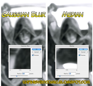
The image above shows a comparison of the effects of the 2 filters. Gaussian Blur basically gives each pixel a new colour based mathematically on the colours of the pixels within a defined radius, with nearer pixels contributing more than distant ones, resulting in a softer, unfocused image. Median, on the other hand, reduces the color variation (or noise) between pixels by giving each pixel the average colour of every other pixel within it's radius. This method results in crisper edges, while smoothing out the tone in the body of a colour block. A common use for this filter is for eliminating the moiré patterns one gets when scanning from a printed image.
You can use either... The Gaussian Blur is best if you don't want crisp edges, Median is best if you do. For the purposes of this image I went for the Gaussian blur. Now for some colour.
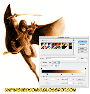
You can use the Hue/Saturation modifier to add color, but I find it a little limiting on the variation you can get in your midtones. The best bet is to use a Gradient map. Duplicate your blurred layer and rename it something appropriate, I went with "Skin" as that's what this colour pass will deal with. Apply a Gradient Map (Image>Adjustments>Gradient map). Click on the gradient bar to adjust your gradient, and add in your midtones. Play with the gradient until you are happy with the colour on your image and then apply it.

You now have a nice colourful image... but the texture of the original drawing is no where to be seen. It's time to put it back. Select your background layer, which should be unchanged from your original scan, select all and copy it. Go into quick mask mode, and paste. You should see a red wash over all the dark parts of your image. The wrong parts are masked though, so we need to invert it.
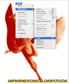

Upon exiting quick mask mode you should see "marching ants" around all the dark bits. Make sure you're you've got the correct layer selected (In this case "Skin".)
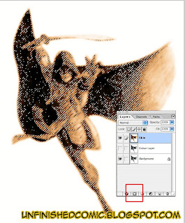

Now we add a layer mask. The button at the bottom of the Layers panel, marked with a red square in the above image. The layer mask will make any pixel not in the selection transparent. and if you turn off your background layer you should see something like this:
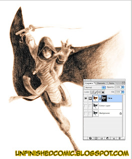

Of course, our serpent warrior isn't wearing skin coloured clothing, and likely your drawing is going to have a bit of a variety of color too. We need to mask out everything that isn't going to be this colour. Ensure that you're working on the layer mask and not the layer itself. You can tell by looking at your Layers panel. If your working on the layer mask, there will be a thick rectangle around the layer mask's thumbnail.

When in layer mask mode you only have the option of shades of grey, white representing 100% opacity, and black representing complete transparency. Use your favourite method to apply black to all the parts that don't need to show through.
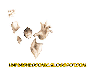
Now go and repeat that with every other colour. This may seem a little tedious, but it's going to keep the problems to a minimum. As you get a feel for the technique you'll run through it pretty quickly and intuitively know where to take short cuts.
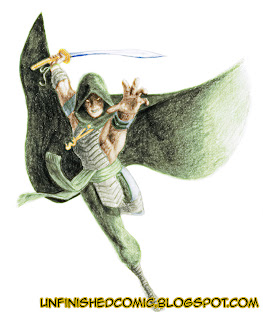


This technique is pretty good for colorizing anything. If there's no grain to preserve (as in a black and white photograph) you can do away with the blurring and layer masks and simply use the gradient map technique. I hope you've enjoyed this tutorial and found it helpful... Let us know what you thought!

Other articles you may be interested in:
One Point Perspective Tutorial
Some of my pencil drawings
Colorised Comic Book Art

Friday, January 2, 2009

5 books that I've found invaluable in drawing comic art

Sadly neglected the Unfinished Comic for a while due to work commitments. A few months ago I picked up a pretty huge job drawing a comic book for an international corporation, and it's been taking up all of a my time, so my side projects have been sidelined since I started it, but now I'm nearing completion on that and can finally get back on track with everything else again!

As a professional illustrator I find it's very important to put a lot of time into developing my skills, especially as their is a higher standard required when you plan on making money out of your art. Apart from just practicing, I read as much as I can on the subject to try and close the gaps in my knowledge a little. This article is about a few books that have helped me a lot in my journey as a comic book artist, and I'm certain that they will be very helpful to you too.

Figure Drawing without a Model by Ron Tiner
Published by David & Charles

Ron Tiner is a very talented illustrator who has worked on quite a few comic book titles including Hellblazer. He's probably more famous for this particular book though. Of all the books I have on the subject, this is probably the one I've read the most. It honestly won't turn you into a great illustrator after one read, and doesn't even try to do that. It doesn't have step-by-step exercises or any of that sort of stuff. It doesn't even go into great detail about technique or style. What it does do though, is give you practical and useful advice on how to practice drawing. It tells you how to get better. How to spot where you're going wrong. It teaches you to observe. I honestly wouldn't be where I am today if I had not read this book, and I think a few years after you have read it, you will probably say the same.


Drawing Cutting Edge Anatomy by Chris Hart
Published by Watson-Guptill Publications

If you are going to draw comics you need to know anatomy. While it's certainly true that you can break the rules of anatomical accuracy when drawing comic books, you still need a solid foundation and deep knowledge of the rules before you go deciding what to ignore in favour of your style. When it comes to anatomy there are many, many books on the subject, and honestly, there are many books far better than this if you are interested in realism and accuracy. This book is, however, absolutely great for those interested in drawing superheroes in a dramatic and interesting way that takes anatomy into account.

This book is the one I'd recommend to younger comic book artists who want to make their characters a little anatomically realistic, but it has been an invaluable reference to me when I need a quick reminder of where muscles need to be, or what they should look like.

People and Poses by Buddy Scalera
Published by Impact Books

This is not really an educational book per se, though it does contain a few short pages dedicated to instruction and advice on drawing. It is primarily a collection of photographs of various models.

Like most artists I have built up a large library of reference photographs gleaned from all manner of places over the years. I have literally hundreds of images of people doing all sorts of mundane things like sitting and sleeping and walking, but I don't really have many photos of people flying or fighting or any of the stuff that heroes typically do in comics. That is what makes this book great! It's full of those kinds of images. There are additional volumes to this expanding on the themes in here, but I have not included them here as they are far more specific, and this one is very general, but it is certainly worth looking at if you are planning on drawing comics seriously.


Vanishing Point by John Cheeseman-Mayer
Published by Impact Books

Perspective is by far one of the most tricky things to get your head around in drawing, even when you have been doing it for a long time. Vanishing Point is one of the most useful books on the subject that I have ever come across. It's not that it's the most explicitly detailed treatise on the various techniques out there, but rather that it has the right information to get the job done, presented in a practical and easy to understand way that makes very helpful to any comic book artist out there, new or experienced.

It deals with the standard 1, 2 and 3 point perspective in enough depth to get you drawing your scenes to a really high standard, and then ups the ante by introducing some more dramatic ideas like 4 point perspective, which you would use to represent multiple viewing angles within a single drawing, and 5 point curvilinear perspective, which resembles the world viewed through a fisheye lens. All of this would be enough to make this book perfect on its own, but they take it further with practical advice on fixing your mistakes, and improving your drawing.

100 Ways to Create Fantasy Figures by Francis Tsai
Published by Impact Books
This book is not really anything to do with drawing comics, but it is packed with useful advice for any illustrator. It doesn't have much to say on technique or style and won't teach you how to draw. It does teach you how to approach creation of characters and ideas though, and it does it well. it covers though processes and idea development, and gives a lot of useful suggestions on how to up your game and create more vivid and exciting pieces of artwork.


I'd be very interested to hear which books you have found interesting and useful in your drawing careers. Please comment with any books that you'd recommend!

Monday, September 8, 2008

Pencil Drawings in a More Realistic Style

For those wondering, I haven't forgotten about "The Unfinished Comic", I've just been quite busy the last few days, and haven't had the opportunity to put any time into the project. While I catch up on the artwork for page 1, I thought a few readers might be interested in some of my other work. These are some pencil drawings I've done over the years in a more realistic style, mostly for the purpose of practice and my own education.


A Pretty Face 2003-2004

If you are a comic book artist or an illustrator yourself, then you already understand that there is a big difference between drawing a female face and drawing a female face beautifully. This may seem counter-intuitive since we see beauty every day, and know in ourselves what we consider to be attractive qualities, but it is actually quite a bit more complicated than that. How do you get better at it? PRACTICE! I've spent years and executed at least a hundred drawings like this one, trying to get a handle on just what needs to be there, and how it needs to look. If anyone asked, I'd say I still need at least a few more years practice, and I think I will still be answering that in a few years.

Serpent Warrior 2004
This drawing is completely "from memory". That is to say that I drew it from an imagined image rather than from a physical model or photograph. It's far from perfect, but upon rediscovering the drawing a few years after having filed it away I was quite impressed with the realistic way I'd handled the cast shadows, especially on the out-stretched hand. I couldn't have managed that without the expertise I got from drawing from reality and photographs as often as possible.


Boxers 2008
In spite of years of practice drawing the human body, I still struggle often with anatomy particularly because I'm a stickler for accuracy and it frustrates me when I can't quite get proportions and anatomy right, so I practice drawing it as often as I can manage. In my more recent practice pieces I've been looking for opportunities to work on shading and texture, and I've taken a preference for drawing figures in motion. I wanted to do a masculine drawing with muscles visible and in action and this pair of boxers based on a photograph I found somewhere or other was perfect for that. It also gave me a chance to study the way cloth interacts with the body which is a pretty complicated affair and another thing that I have always struggled with as an illustrator.


For more of my comic book like artwork have a look these:
No Pain, No Gain pencil comic book art
No Pain, No Gain inked comic book art
No Pain, No Gain coloured comic book art

Wednesday, August 27, 2008

How To Draw Comics: One Point Perspective Tutorial

Part of my intention with the Unfinished Comic project is to share some of the knowledge and techniques that I've acquired through the years that I've been doing this. There are several books out there on how to draw comic books, but for the most part the idea of perspective is overlooked and shortchanged in those otherwise helpful publications, with a mere paragraph or page given to a subject that could honestly fill a pretty thick book. This is an intermediate level tutorial on one point perspective and assumes that you are familiar with a few of the basic concepts, like eye-lines and vanishing points.

This tutorial details how I went about drawing the second panel on Page 1 of Hurt! You can have a look at the script and thumbnail page by clicking on their respective links, and the finished pencil art will be up soon.

Preparation:
You will need the following tools:
  • Paper. If you're drawing for a comic book, just draw directly on your layout page.
  • Pencils. You want a pencil with a hard lead like a 4H. Firstly because it's lighter and secondly because harder leads stay sharper for longer and sharpness is essential. I use a good old-fashioned wood-bound pencil that I sharpen with a blade, but you can use a mechanical pencil if you prefer.
  • A ruler. Preferably a really long one. Your vanishing points can be quite far off your page sometimes so you need a straight-edge that will reach that far.
  • A set square. This makes it pretty easy to get your right angles accurate. Also very useful for doing a quick series of parallel lines.
  • A french curve and an ellipse template or two. Like a straight-edge but for curved lines. When doing curves and ellipses without these they'll look sketchy. These tools help keep your curved lines nice and crisp.
  • Patience. It takes a lot of time to do an accurate, elaborate perspective drawing, and it can be a little repetitive too, especially when you're drawing a massive cityscape or even just a single building with a lot of architectural detail. It's worth the effort when you're done though!
Being an aspiring comic book artist, I'm sure you'll already have all of those ready and waiting for you at your favourite drawing spot so now we get down to business. Before you go tackling anything as complicated as a detailed perspective drawing of a scene, you should spend a little time planning.


Above is a simple map layout. The graph paper makes it pretty easy to quickly map out a scene in your mind and decide on the position of things. It also greatly simplifies the geometric considerations and eliminates the need to measure everything, though a ruler is still useful for keeping your lines neat. You can also use the squares as a rough guide of scale.

You'll also want a rough sketch of how you envision the scene looking. this is for your reference only so it can be as neat or as rough as you like. The important part is that it gives you enough information to accurately create your scene when you get down to the final crunch. This is a quick throw together of the scene described in the script for the second panel on Page 1.
Panel 2. Much closer in now, focusing on the exterior of a mansion. There's a party going on in the garden. Tables decked with food surround a bunch of mingling well dressed guests. A good time is being had by all.
The script calls for a party outside of a mansion. As an artist we'll need to put a little thought into what this mansion would look like. We know that it's set in Cape Town from the description of the first panel but the rest is up to us. I decided I wanted to go for a classic looking mansion rather than something modern and even though I haven't spent a lot of time in and around Cape Town I know that the city is famous for it's Cape-Dutch architecture. I do a little research to fill in the holes in my existing knowledge and find that a few hallmarks of the Cape-Dutch style are the H-shape of the building, the ornate gables and the french windows. Research is always a good idea when tackling this sort of project and can help you to add a lot of authenticity to your drawings. Now we start with the technical stuff!

Step 1: Establish your eye-line and main vanishing point.
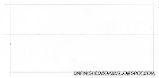
The outer box here is the outline of our comic book frame. We can consider the frame to be a snap shot of what we are looking at. Imagine for a moment that you have an infinitely long piece of string that extends from the dead centre of your camera's lens all the way to a really distant focus point with no slack in the line. In the photograph that infinitely long string would appear as a simple dot and any lines running parallel to that string will all seem to be pointing towards it. This is our vanishing point. Not every line in our image will point towards it. Only the lines that are parallel to our imaginary string. If we turn that stretch that string out so that it becomes a horizontal sheet instead we will have a line across our photograph that divides it into 2 equal halves. This is our eye-line. Any object below it will be seen from above, and any object above it will be seen from below. People often refer to the eye-line as the horizon, but they are not necessarily the same thing. The horizon and eye-line will only be the same if the viewer is looking directly out towards the horizon, (so that the imaginary string in our example is perfectly parallel to the ground.) With a high shot looking down, the horizon is above the eye-line, and with a low shot looking up the horizon is below the eye-line. I've decided that I want the view point to be straight out towards the horizon so I've put my eye-line exactly in the centre and marked the centre of that as my vanishing point.

Step 2: Block in your main object.


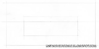
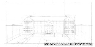
I decided in my planning stage that I wanted to see the mansion from a high vantage point, to establish the setting rather than focus on the party guests, taking into account the events i know are coming up in panel 3 from the script. Referring to my plan sketch I figure that the lower edge of the roof should coincide with my eye-line so I draw in a block with roughly 3 quarters below the eye-line and a quarter above it.

Step 3: Give your object some depth

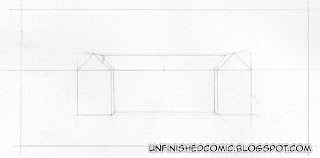
I've now drawn in the basic shape of the gables of the 2 wings and decided how wide I would like them to be. I extend some guide lines from each of the corners back to the vanishing point, and use these as a reference to draw in the main body of the house. It's already starting to look like a 3D object now, though it's still very rudimentary and unembellished.

Step 4: Build up the shape.
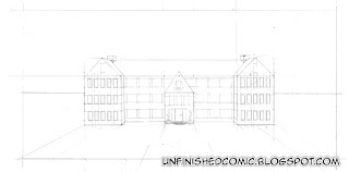
Now I've added in the position of the central foyer which extends forward from the main body of the building. I've added in chimneys and I've started laying out perspective guides for some of the foreground details. I've also added in a guideline for the perimeter wall of the grounds. I didn't calculate the position of that with perspective but did it by eye as it is a fairly arbitrary background object and the effort would not have been justified. I put it in a position that looked to be about one storey high, a fair distance from the main building.

Step 5: Add in details

I've marked out the position of the windows. I know how many windows I want and their rough position from the plan sketch that I did before I started. Now it's just a matter of pain-stakingly measuring them out and drawing them in. For the windows on the side walls I have estimated approximate positions and diminished the width of the more distant ones by eye.

Step 6: Foreground Details
With the main body of the house sorted out I turn my attention to the foreground. Draw in the pool and the tables and mark the position of the trees. As the trees get further and further away the gap between them appears to get narrower as a result of perspective and foreshortening. There are accurate geometrical methods for working out the diminishing gap but that sort of mathematical perspective is a complicated affair. If anyone is interested I will do a proper tutorial on it down the line, but in the mean time I've cheaped out and used a short cut that gives good results in a fraction of the time. I used 5 trees on each side and marked out the height of the first tree and projected perspective lines back to the vanishing point. I then marked out the height of the last tree forming a quad. I then drew diagonal lines from the opposing corners to mark out the perspective centre, the position of the third tree. I then repeated that process to find the positions of the second and fourth trees.

Step 7: Finish it up

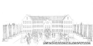
Now we've come to the end of a very long road, and start on another one. I used a darker pencil for the above steps so that the scanner would actually pick up the pencil, if you've been using a hard pencil like a 4H and don't press too hard then you should have fairly feint guide lines on your page. If they're kinda dark then simply take your eraser and lighten them to a point that you can still see them but they're not too pronounced. You don't want to see any of those lines in your final drawing. The first thing I did in the clean pencil art was to draw in all the people and objects in the foreground and then slowly worked towards the background, adding details as I went.

I am almost done with the rest of this page's pencil artwork and I will post it soon. In the mean time, if you'd like a taste of what's coming have a look at this example of pencil comic book art, and the inked version and final coloured piece.

Friday, August 22, 2008

Please Rate our Posts

Hi,

We have just added a rating facility at the bottom of every post. Please feel free to rate our posts and be honest because this will help us to improve our content. All you have to do to submit your rating is click on the relevant star (1 for horrible and 5 for excellent).

Regards,
The Unfinished Comic Team

Sunday, August 17, 2008

Hurt!: Page 1, Thumbnail Comic Book Art


Now we have a nicely planned page, and can see where the text goes and how much space we need for it, and also have a feel for what each frame will look like. It's still planning at this stage and far from the graceful dramatic art we're used to seeing in comic books, but this won't generally be seen by anyone except the artist and maybe the editor and writer. Next step is to sit down with a pencil and clean it up nicely.

Page 1:
Script
All thumbnails
Pencils (coming soon)

Page 2:
Script (coming soon)

Hurt!: Page 1, Planning Comic Book Art with Thumbnails


Thumbnails are a great way to plan out your page layout. They're small and simple so you can crank out a few of them in a matter of minutes. This lets you try out some dramatically different variations to see what works best for you.

The first one above is simple and straight forward. The frames are equal in size, which may seem boring by modern comic book standards, but it offers a lot as far as pacing goes. The nice big frames allow for a lot of space for detail so that's an appealing factor. The repetition also ties the 3 frames together and implies continuity between them.

The second takes a different approach. The angle on the city is much higher up. This is a great image, and the possibilities are exciting with such a dramatic angle. The problem with it is that Table Mountain is seldom seen from that angle, and it's not as recognizable even to the folks who actually live there.

The third is not too different from the first but the frames are used as tension building device.... The outlines grow thicker and more erratic as the story progresses. With a comic book this idea seems cool, but in practice it might be over kill.

Have a look at the comic book script for this page, and have a look at the thumbnail I chose.